
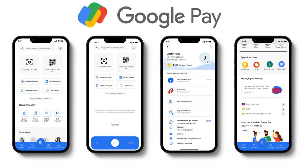
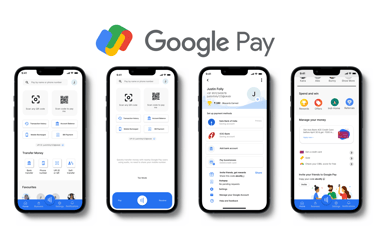
A redesigned Google Pay application aims to provide a seamless, intuitive, and secure mobile payment experience. The concept incorporates a simplified user interface with enhanced navigation, allowing users to effortlessly manage their transactions.
The focus is on creating a visually appealing and cohesive design that aligns with Google's Material Design principles while prioritizing user convenience. With improved accessibility features and streamlined payment flows, the redesigned Google Pay aims to revolutionize the way users engage with digital transactions.
My Role
As a designer for the Google Pay application redesign, my role is to bring the concept to life through thoughtful and user-centered design solutions. I focused on enhancing the application's visual appeal, optimizing navigation, and simplifying transaction flow while adhering to Google's Material Design guidelines. Additionally, I strived to incorporate accessibility features to provide a delightful and secure user experience.
Problem Summary
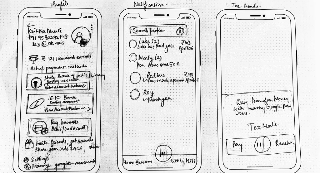
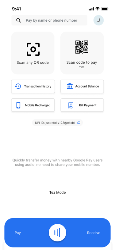
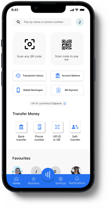
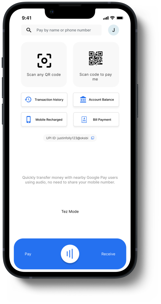
The challenge lies in locating a barcode for receiving payments and a scanner for making payments.
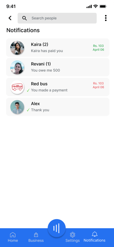
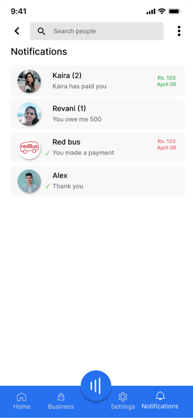
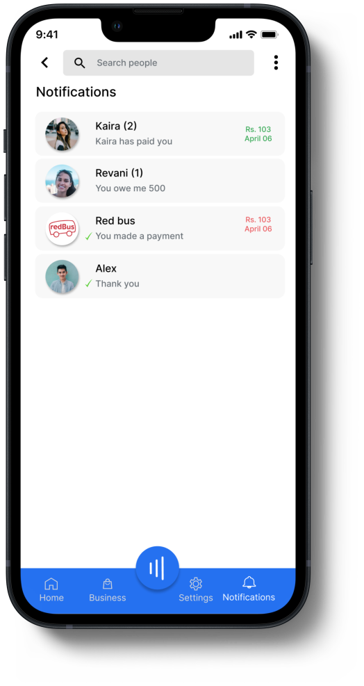
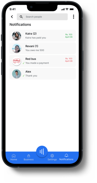
Difficulty in identifying the latest notification with a minimalistic blue dot indicator.
The need for seamless instant transactions using the Tez mode.


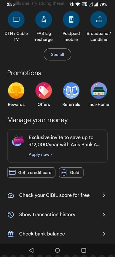


Simplifying the navigation to easily access account balance and transaction history.


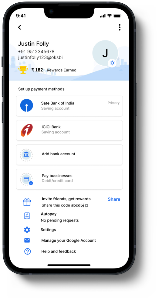
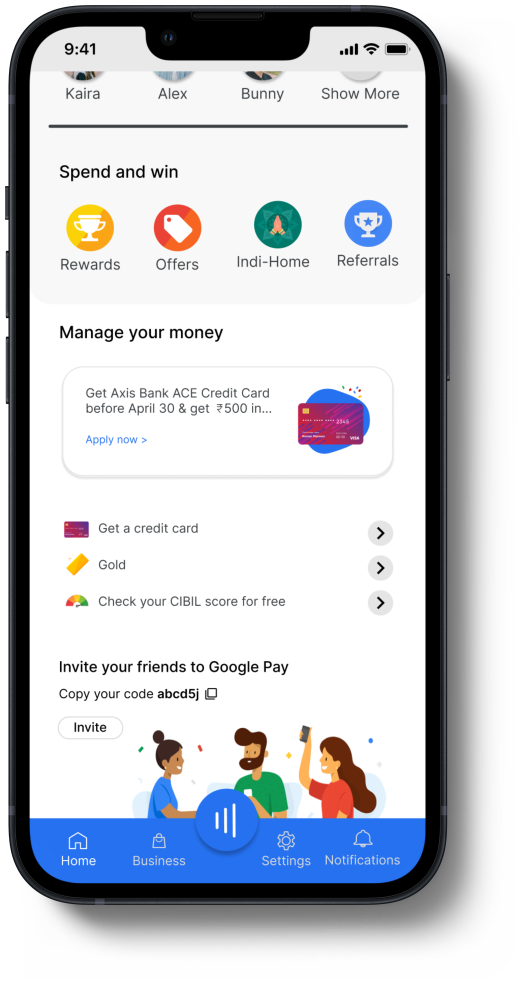
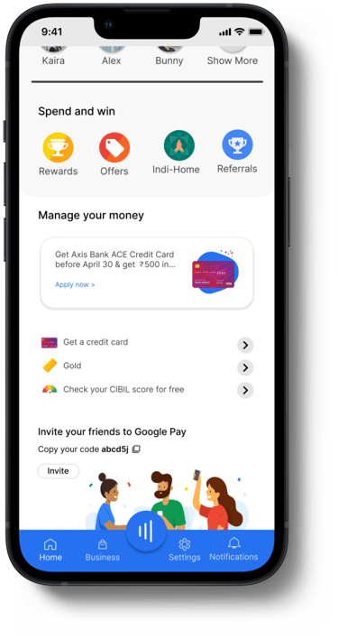
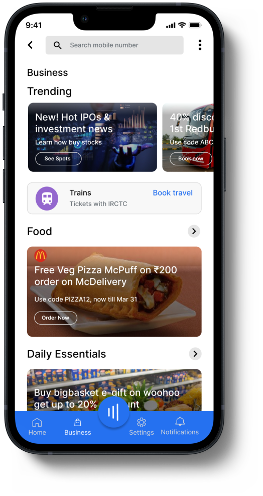
The presence of numerous elements in the business section causing clutter on the home page.
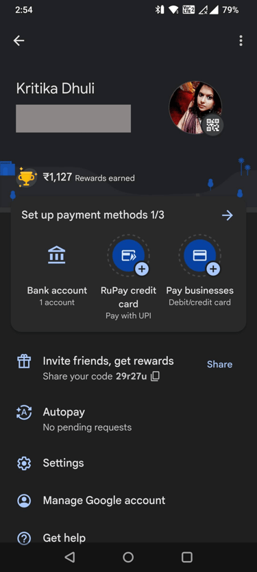
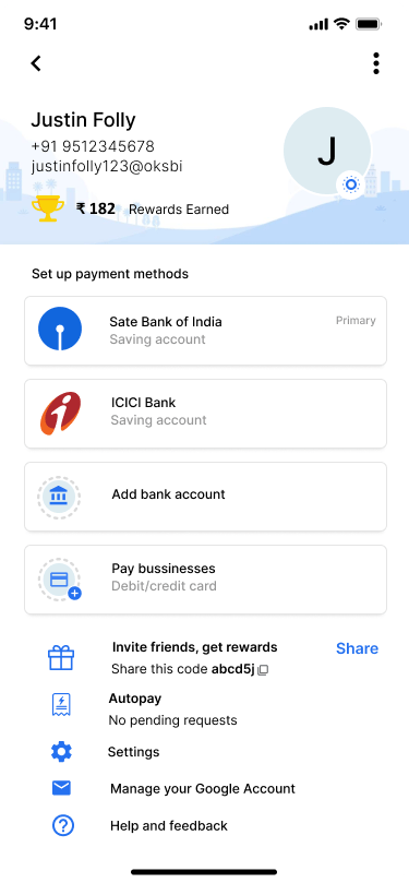
Inefficiency in locating the bank account list within payment methods due to unnecessary clicks.
Solution Summary
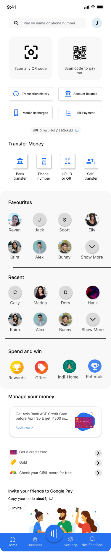
Implement a prominent barcode scanner feature within the app for convenient payment receipt and integrate a barcode generator for easy payments.
Streamline the navigation by providing a dedicated section for account balance and transaction history, ensuring quick access and improved user experience.
Enhance the notification system by utilizing more intuitive and visually distinctive indicators for the latest notifications, ensuring better visibility and user awareness.
Simplify the business section by reorganizing and decluttering the home page, emphasizing essential elements and reducing visual noise.
Optimize the payment methods section by reducing the number of clicks required to access the bank account list, improving user efficiency and ease of use.
Integrate a seamless and fast transaction option through the Tez mode, allowing users to complete transactions instantly with minimal effort and wait time.
User Research
Secondary research on Google Pay involves gathering information from existing sources such as articles, reports, and studies to understand its features, user experience, market trends, and competition. It examines user feedback, adoption rates, and usability to gain insights into strengths, weaknesses, opportunities, and threats, as well as user preferences and pain points.
Based on an unstructured interview with 10 participants, Google Pay emerged as the preferred choice for transactions. Users provided feedback on their usage, emphasizing frequently utilized features and suggesting improvements for faster payments. A proposed design solution aims to streamline the interface, simplify the process, and enhance efficiency for a seamless payment experience.
Secondary Research
Primary Research
Paper Wireframes


Screens

High Fidelity Mockups
What I Learned
Key learnings from this project include the importance of delivering a user-friendly and reliable payment experience, optimizing core features based on user feedback, and prioritizing efficient and streamlined processes. The proposed design solution aimed to create an intuitive and efficient experience, emphasizing the value of user-centric design principles.
MY OTHER WORK